
 |
 |


 0
0 
Wed, Jan 26, 2011, 2:16 pm CST
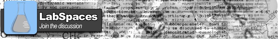
I had my photog friend whip up a quick beaker. Do we like this one better? I think I do.


Wed, Jan 26, 2011, 2:41 pm CST
It has kind of a comic book feel, I like it a lot. It's amazing how much simple little changes like this can change the feel of a site. I'll get working on spiffing up the menu soon. That's a bigger pain in the ass.
Wed, Jan 26, 2011, 2:57 pm CST
Yes, I like the new "comic book" feel to it myself. I like the black outlining of the LabSpaces in the logo. If we could see something similar with the Releases and Blogs menu lines as well (might need to drop a couple of the options to make room for larger fonts), I think that might be cool.
You still going to go with plans to change the page layouts? Based on the new banner we might want to revisit that to ensure that it all flows smoothly (though I imagine changing the colors of the templates should be easy enough for the most part).
Wed, Jan 26, 2011, 3:02 pm CST
I'll get approval for the layout changes before I make them live. That's a much more involved process. I'll make a new post and we can decide on final layout changes in a week or so. First on the list is coding a new section of the site: a Job Board :)

Thu, Jan 27, 2011, 3:49 pm CST
I really like the new banner and tag line, too - lookin' good. :)
Sat, Jan 29, 2011, 10:59 am CST
Thanks Dr O!
I think I like "Join the discussion" better. What do you all think?

Sat, Jan 29, 2011, 7:10 pm CST
Definitely like "Join the discussion"

Sat, Jan 29, 2011, 11:27 pm CST
I like it!
Hey lookie that.. I joined the discussion!
Sun, Jan 30, 2011, 9:39 am CST
Welcome to the party, Lab Mom ;)

|
|
 |
 |